Monday 3 October 2011

DIANE ARBUS

As I was off over the Summer - student life is a difficult one to live. I thought I would take the time and go to London. I visited the Tate because Diane Arbus had an exhibition. I was looking forward to seeing her work as actual prints as I have only seem them in books and internet.

When we arrived I was instantly drawn to the image, The  Boy with Toy Hand Grenade. It is a bit disturbing to look at. Along with many of her images, that is what she is mainly remembered for. She caused a lot of confrontation and her typology on 'Freaks'. People's opinions are varied. Some say she took advantage of the situation and others say she was simply educating people. I can see both sides of the story, down to the way she portrayed them to be, with the lighting, black and white photography.
Very gloomy images. She wanted to be someone else, she wasn't happy with herself or who she was.


The layout of the exhibition could have been better to be honest. There were 3 small rooms. The biggest prints couldn't be larger than 12x8.
The frames were cream and the prints mounted on white card.
Overall I would say the visit was a disappointment, I wasn't inspired from the exhibition.

However, there were other exhibitions going on and I went and had a nose.

I came across a photographer's work interested me. Boris Mikhailov. He did a series called 'Red'.  There were a lot of images on the wall. Every image had the colour red in them. It was interesting.


I liked the layout of the exhibition, it was modern and caught my eye.
It inspired me.

I think the layout and the way the exhibition is seen is very important. Size does matter! Wheeey!!!
No seriously it does. If it is a large print, you feel part of the photo. You can really get in there and see it. If it is small you generally see everyone start to, lean in and squint to see the image.

Make an impact.

www.trevpayne.co.uk

Tuesday 28 December 2010

Generating Emotion through text

Text is a great way to change the meaning of an image. You can change the focus point of an image and you can also generate great emotion.
Gillian Wearing is a perfect example for this. She did a project called "Signs that say what you want them to say and not Signs that say what someone else wants you to say". She took photographs of normal people, got them to write down their feelings or an issue they had with the world and took a photo of it. It was very successful and this idea rubbed off on a lot of people. The idea spread because it works. It completely changes the photograph by putting a bit of text on a piece of paper. Its real documentary photography.
This photo changes the emotion of the photograph. The sign reads, "I have been certified as mildly insane!"
Without the text on this photo it would just be an image of a random guy in the street however, by adding type you are generating emotion. You are adding a story to the image, taking the viewer on a journey. You feel sorry for the man. It just goes to show that you shouldn't judge anyone in life. That is what the visual arts are about, teaching people, understanding people, sending out a message and taking people on a journey. I love being able to make people feel how I want them to feel. 
If you can make someone feel an emotion while they are looking at your art, they will remember it, it will stick into their memories and they may relate to it.

Sunday 26 December 2010

How does text effect the meaning of an image

As soon as you add text to an image, straight away you change the effect it will have on your audience. Maybe for the best or visa versa. Generally, we use text on an image to give information. To inform the viewer of what is happening, or happened. Also visual heir achy comes into play. What do you want the viewer to pay attention to, the image or the text?
How big is the text?
What colour is the text?
Is it bold?
Is it subtle?
All of these have a different effect on the overall outcome. It isn't just the case of slapping a word in the corner. It is thought through. However, be real with it. Shocking images generally don't need any text, it will be pretty straight forward as to what is already happening.
The type on this image effects the image in a way in how it helps the viewer relate to it generating emotion. It brings meaning to the photograph. Whatever you put on the photo, that is going to be the story the viewer looks in to. Nothing else. So I look at this image and I feel sorry for the poor guy, he just wants to forget something. I only know that because of the type, without the type I would probably be jealous of him. He is in a beautiful location, by the sea, he seems to be free from issues, bills etc! Nothing between him and the great ocean. So by adding type, you are restricting the viewer from seeing a bigger picture. Good thing or a bad thing? Well it completely depends on what you want the viewer to see, as a Visual artist, this is your power. Superman can fly, Spiderman can make webs and catch bad guys, Johnny Bravo can pull extremely hot cartoon chicks! We can make people see what only we want them to see.
Selfish??


I don't think so.


Getting rid of Assumptions

Some people say the best designers are mad. They have outrageous ideas that will never work. Is this true? Or is it simply thinking outside the box and being different?
There are a number of ways in which to "break the rules"! Whatever your subject is, look at similes, metaphors to try and branch out and try and get that spark. These are different thinking strategies that will definately help to generate more ideas, yes, they will be more wacky and out there than your normal everyday ideas, if someone plays a word association game for example, take the word black, the first word you will say back is white. Keep going, say other words, Im going to say what is popping up in my huge brain associating with black.... Evil, Dark, Night, Stars, Badger. You get the idea, without taking the first idea, you get a wider range of ideas, fun ideas, strange ideas. Most of them won't work but you may get one idea that will make it.
An artist I like that uses this style is, Yuko Shimuzu.
She takes very known pieces of work, e.g The Great Wave. She incorporates different elements into the image which changes the meaning completely. Notions of Originality fits into this as well.


By changing the elements in the image, it reflects on the audience and changes the target audience.
It is different, a little disturbing but it works. If you break down her work methodology, you can see how she got to the idea by doing simple word associations, not going with the first ideas, think outside the box. Being different is very important. Unless she has very long hair in real life, then it isn't that impressive however, I am sure this isn't the case. She probably has no hair. Bald even. Who knows! None of the less, it works!

Tuesday 23 November 2010

Managing a Creative Environment.
You should be able to tell apart certain professions. For example, if you take an office worker and an illustrator, their workspace should be very different from one another's. 
Artist's collect things, bits of inspiration. It is a great way to incorporate subject into your work. You are excited by your collections, they inspire you. Before you no it, you have a stack of findings. Put these up on your wall, on your notice board. Put your art work up. The more creative your work space is, you are more likely to do more work and it will be of a better standard. I'm not saying if you put up a few pretty pictures and say abra cadabra then your work will turn into something worth millions, doesn't work like that, but you will be driven and excited about being in a studio that is filled with visual ideas and reference that you will want to work and you will want to produce something amazing.
Here is someone's work space. It isn't too messy stopping him working but there is a lot of material in there. If he is stuck on an idea, he could look around his room at his work and other work he has collected and get inspiration and maybe help him spring up a new idea. Your work will be reflected on what it looks like, so it should reflect off you as a person meaning your work space should reflect the same feel as well. You will feel good when you are in your studio, its your own little world where you can get away from it all.
I have my own personal studio. It is how I want it and I get inspiration from it. I don't like to fill my space up with everything I own. I consider myself as a minimalist. Less is more. This is my analogy and I stick to it in my work. This doesn't mean I don'y collect things and have as much things as others, I just store my material differently. I like to have a clear head and I like to have a clear space, if my place is cluttered, me head gets cluttered and I find it hard to think. People work in different ways and its important this happens. If everyone worked in the same way, all the ideas would just be getting used all the time and nothing new and exciting would be happening. So keep your style. Be proud of your studio. Be excited to put that photo up on your wall.

Tuesday 16 November 2010

Productions and Outcomes

Interpretation
We are in a world where change is always happening, there is always something different taking off, a new lead, a new way of doing things.
As a designer, it is so important that you are aware of everything around you. 
Today, we have the power to manipulate something and change the meaning of the story to who we wish to aim it at. I am going to look at the same movie but one has a very different twist on the original and explain the reasons for the change.
am going to discuss Star Wars. Star Wars was released in 1977 and it is without a doubt, the best science fiction film that has ever been released, I am not a huge fan of it but I am aware it has changed the way we look at films and it is a very powerful film. 
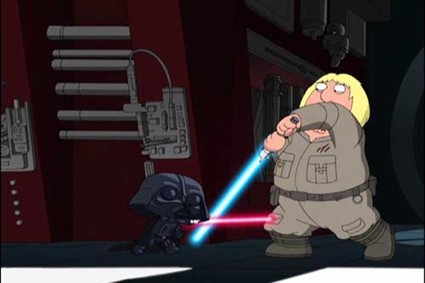
This is the cliche image when you think of Star Wars. The battle. However, I am going to compare it to this.
This interpretation of Star Wars is Family Guy. A humorous take on the legendary film, straight away you can see the content has changed. For starters, it is cartoon where as the original is obviously real actors. Family Guy already have their own audience, but by doing Star Wars, it is grabbing a huge audience on top, the Star Wars geeks! They are going to want to watch this and compare it to the original. The storyline has stayed the same but the meaning has changed, it was made in a different time to the original so the take and the reaction will be different. The Family Guy take is very funny and it takes the mickey out of the original, but it is the directors interpretation on the film so it is going to reach out to a certain audience. Over time, you can see it change and the media change to get a completely different message.

Delivery
When designers design, they have to be aware on what they are designing and who it is for. This opens up to a big issue they need to resolve. What platform are they working to?
There are a number of platforms and all used in different ways;
Editorial,
Publishing,
Online,
Advertising and Branding,
Textiles/Fashion,
Installation and Interventions.
All very different platforms, so which one to use? It's simple, just decide what you are doing, is it an advertising campaign? If yes then you work on the advertising platform and so on. This would be anything from T.V ads to huge billboards all over the country. When you choose the platform, you then choose the audience.
You should be able to tell what the poster or website etc is for by looking at it.
Some designers use video and time lapse to show their work, it shows the journey they have gone through. Basically a camcorder playing in the corner and then speeded up, very simple but its very interesting t watch this piece of work taking place. Its qwerky! For example, take Blu's work. He works on very different platforms but has the same style in all of them.

Two different platforms, side of a building and a website. Two different ways of getting his work out there. But they are both the same style so you know straight away who's work it is so you can relate to it. Blu also works on video and stop start animation. He is a very determined artist and very interesting to watch his pieces take shape. This is all a way of representing yourself through platforms to show you are versatile and experimental. People like to see use of different materials, it keeps them interested and wanting to keep looking at your work.
So be experimental, be brave and take risks, all the best designers do.
On that note, Goodnight and don't let the bed bugs bite!


M o v i n g I m a g e

The Three Act Structure
ACTION!!!
When you are born, you have a beginning, middle and an end in your life. The same with books, with everything really, and it is no different in Film. 
In film it is broken down to Establish:Crisis:Resolve. The start of the film is all about setting the scene, knowing where the film is taking place, introductions to characters. The crisis (middle) is pretty self explanatory, a crisis is going to happen, a war for example and then resolve, where you see the outcome and how everyone lives happily ever after! Or do they in some cases?? This can also be broken down into time, generally it looks like this....
30:60:30, the middle and end don't need as much time as the middle, this is down to the crisis is the main part of the film, its the action, what people want to see. 
Let me take one of my favourite films and go into more detail, Avatar. If you don't like Avatar, then get off my blog!!
Okay, now we have said goodbye to the unfortunate people who can't appreciate an amazing film we can get down to business.
As you are more than likely aware, Avatar is a long film, the duration is over three hours, so where the normal case is 90 mins - 120 mins, this is longer so the timings for the three acts are going to be longer. 
Avatar and many other films have something called a Protagonist. This is the hero, the main man, he is the dogs b******s! Lets face it, we all want to be him. You cannot have a three act structure unless you have the hero. This is because it all follows suit, the story. The end of Act 1 (the beginning) ends when the protagonist makes a commitment, this is what leads us into the crisis, (Act 2) the training and the war. This is the part of the film that people want to see, its exciting, emotional, it draws you in. In Avatar, he protagonist commits to more than one one film, so which is the cut off point, is it when he is going to and make the natives move to a different location or when he stands and fights as a native and betrays his own race? The cut off point is when he decides to betray his own race, this is the crisis, you see people die, things close to them get blown away. There is a inner story, and this what you watch, you see the hero grow as a person, mentally and physically, you get attached to him (the training)You want the hero to win, and the thing I love about Avatar is that you want the "blue monkeys" to win the war, you want them to defeat the humans which is our own race! It is a powerful film to do this. Then the resolving of the crisis, what happens next? How does it all end? Again, should last around the same time as it started. We need to no what happens at then end of the film so we can all sleep at night knowing the blue monkeys are victorious!!


Character Development
Why do we represent protagonist and villains the way we do? It is because we all stereotype. By doing this, we can appoint the characters to the audience before we even introduce them. For example, Luke Skywalker and Darth Vadar. The protagonist (Skywalker) is in white and the antagonist (Vadar) is in all black. This is going back to basics and subliminal messaging. It is easy for us to pick up on this. In Avatar, you have the purity in the Avatars, the lack of clothes, the native spirit, where as in the human, the antagonist has scars on his face, his voice, everything is representing the bad guy! Easy for us to see who the good guys are and visa versa. 
There are different elements to character design.
1. Appearance- what they look like? The costumes? Colour?
2. Action - what the character does?
3. Interaction - how does the character relate to the characters ad the events in the story?
4. Rely on stereotype- we do this as much as it is cliche.
When all these are answered, you can develop your ideas and create the perfect protagonist/antagonist.
You also look into the dialogue, the way they talk, the vocabulary. E.G Darth Vadar's breathing. A typical stereotype of the antagonist. All in black with a scary helmet breathing heavily = scary!
Its what goes into the designs and how they convert to the movie. It should be obvious for the viewers to make judgement on the characters and realise who is who. If this isn't the case then the film is hard to follow and it confuses you.
THATS A RAP!!